
While UX is frequently associated with complex surveys and user feedback, a wide range of relevant performance metrics can efficiently convert the impact and outcomes of your efforts into objective and insightful data points. Steve Jobs once said: “Design is not just what it looks like and feels like. Design is how it works.” To know how your design works, you need to identify and track the relevant key performance indicators and metrics.
Why is it so important to assess the performance of your design? According to a McKinsey study, companies in the top quartile for design outperformed competitors in the sector by 32% in revenue growth and 56% in total returns to shareholders over five years. This impressive advantage highlights measuring design outputs as an effective way to know how your website design works and indicate areas that may be further improved.
We’ll explore design metrics and key performance indicators, focusing on their importance, variety, and calculation. You’ll also learn best tips to enhance them, and thereby boost the impact and outcomes of your design.
What Are Design Metrics and KPIs?
Design metrics and key performance indicators (KPIs) are measurable characteristics used to quantify and analyze the success of design projects. They provide helpful information about how well your design strategies are performing and whether they align with best design practices and your organization’s goals.
Design Metrics
These are numerical data quantifying design features, such as page load speeds, click-through rates, conversion rates, and user engagement. They serve as an objective means to assess the performance and impact of a design.
Design KPIs
They are high-level, strategic indicators of how well design efforts match larger corporate goals. KPIs determine the efficiency of your design initiatives in meeting your company’s objectives. Examples include indicators such as revenue growth, customer retention, and customer lifetime value.
Why Keep Track of Design Metrics
Now that we’ve defined design metrics and KPIs, let’s discuss why measuring them is crucial for design success.
Securing the Budget You Need
Measuring design KPIs allows you to show stakeholders the tangible impact of your effort. When you demonstrate that the design increases conversions, user satisfaction, or brand perception, getting your projects’ budget and resources becomes more accessible.
UX Strategy Improvement
Design KPIs provide actionable data that may be used to inform your design strategy and improve user experience. Regular performance measurement serves a dual purpose. It enables you to tackle emerging issues swiftly and provides a longitudinal view of your UX journey, which helps avoid potential UX mistakes. Taking such a retrospective angle assists in gauging the efficacy of your overarching UX strategy. You can determine whether your endeavors align with the desired strategic trajectory by analyzing the past six or twelve months.
Measuring and Demonstrating the Value the Design Brings
The relevant KPIs empower performance evaluations and demonstrate the impact of design on the overall user experience and achieving business objectives.
Maintaining the Health of UX
Monitoring design metrics and KPIs regularly allows you to keep your finger on the pulse of your product’s user experience. If you see a drop in essential indicators, it functions as an early warning system, alerting you to potential problems that must be addressed before they become critical.
Support of the UX Maturity in Your Organization
UX maturity reflects an organization’s commitment to UX design. Companies with elevated levels of UX maturity tend to allocate ample resources to UX initiatives, rely on data for design choices, and prioritize the end user. The higher an organization’s maturity in embracing UX, the more effectively it can deliver outstanding user experiences and gain the associated business rewards. Identifying, tracking, and utilizing design KPIs and data is a step towards ascending the ladder of UX maturity. This journey benefits you and your team, the end users, and the overall business.
Critical Design Metrics You Need to Track
Creating user-centric and compelling digital experiences requires measuring design success. Designers use various metrics and KPIs to analyze user interaction and satisfaction. Let’s look at some crucial design metrics and KPIs important in determining design effectiveness.
Google HEART as a Design Metric Framework
Google HEART is a comprehensive user experience measurement system. It includes five main metrics:
- Happiness: Happiness measures user satisfaction and overall satisfaction with the design. It frequently incorporates measures, such as Customer Satisfaction and Net Promoter Scores.
- Engagement: Engagement measures user participation and interaction with the design. This category includes metrics, such as time spent on a page, frequency of visits, and feature utilization rate.
- Adoption: Adoption measures how well people accept the design. Metrics like the number of new users or accounts can be helpful.
- Retention: User loyalty and the chance of returning to the site are measured by retention. This measure is commonly connected with retention and churn rates.
- Task Success: Task success measures how effectively users can achieve their objectives within the constraints of the design. Metrics such as task completion rates, mistake rates, and navigation patterns provide information on task performance.
|
The Google HEART Framework |
||
| The HEART Metrics | Goal | Metrics |
| Happiness | Users feel that the web/app design is unique and offers seamless outstanding experiences | Customer Satisfaction
Net Promoter Score Perceived Ease of Use System Usability Scale |
| Engagement | Users keep discovering more content/features and interact with them | Number of interactions (uploads / downloads / videos watched) |
| Adoption | Users use the site/app | Number of new subscriptions/ purchases
Feature usage rate |
| Retention | Users keep using the site/app | Number of repeat purchases/subscription renewals/upgrades |
| Task Success | Users achieve their goals | Task accomplishment rate
Time on task |
Behavioral vs Attitudinal Design Metrics and KPIs
It is critical to understand the distinction between behavioral and attitudinal KPIs. Behavioral KPIs are concerned with what users do, whereas attitudinal KPIs are concerned with what users say or feel. Knowing the differences between these two types of KPIs is critical for companies seeking to acquire a thorough insight of their consumers and improve the customer experience.
Behavioral KPIs
Time on Task
Time on task measures how long it takes users to complete specific actions. Shorter times often indicate efficient design and usability.
Task Accomplishment Rate
The task accomplishment rate measures the proportion of users who successfully perform a specific task or action with the UI.
How to Calculate Task Accomplishment Rate
You can calculate it by taking the number of tasks successfully completed, dividing it by the total number of attempted tasks, and then multiplying the result by 100.
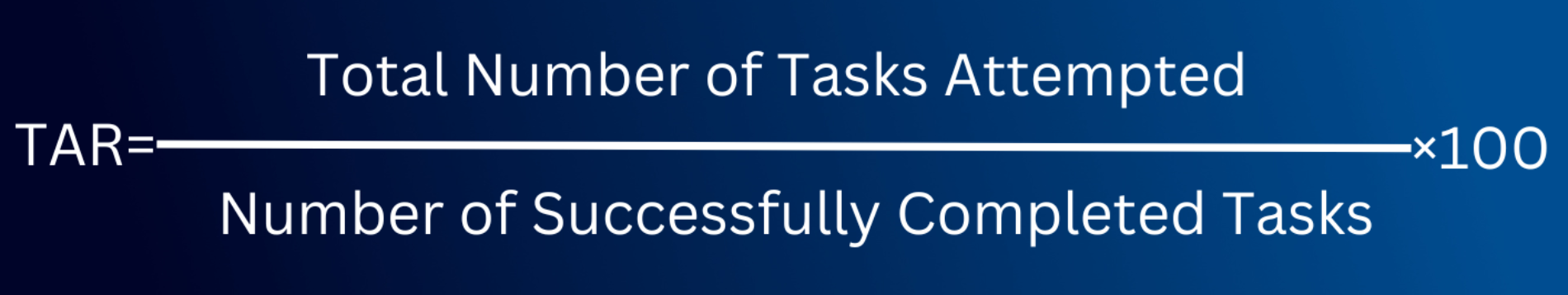
For example, 10 participants tried to order balls (10 blue, 10 yellow, and 10 red) using express delivery and credit card payment on a toy delivery website. Eight succeeded, while two faced issues: User 1 with payment trouble and User 2 couldn’t find yellow balls.
So, in this case, the task accomplishment rate is: (8/10) x 100 = 0.8 x 100 = 80%
User Error Rate
The user error rate quantifies the number of user errors or mistakes encountered during interactions with the design. It indicates how clear and user-friendly your website is. The greater the user error rate, the greater the amount of usability issues. User errors in UX can be considered as slips or mistakes.
Slips occur when a user intends one action but inadvertently carries out another. For example, imagine someone who wants to click on a “Submit” button but accidentally hits “Reset” due to the buttons being too close. On the other hand, mistakes arise when a user’s understanding of a design doesn’t align with the actual design. Such errors point towards inherent design flaws. If a user thinks the magnifying glass icon will enlarge text because it’s next to a paragraph, but it actually initiates a search function, they’ve made a mistake based on a misleading design.
The error rate represents the frequency of user mistakes during a task. It can be gauged through two primary methods:
- Total Error Rate, which measures all the errors made
How to Calculate Total Error Rate
The total error rate is determined by dividing the total number of errors made by the number of attempts to do the activity. Multiplying the result by 100 will give the percentage value.
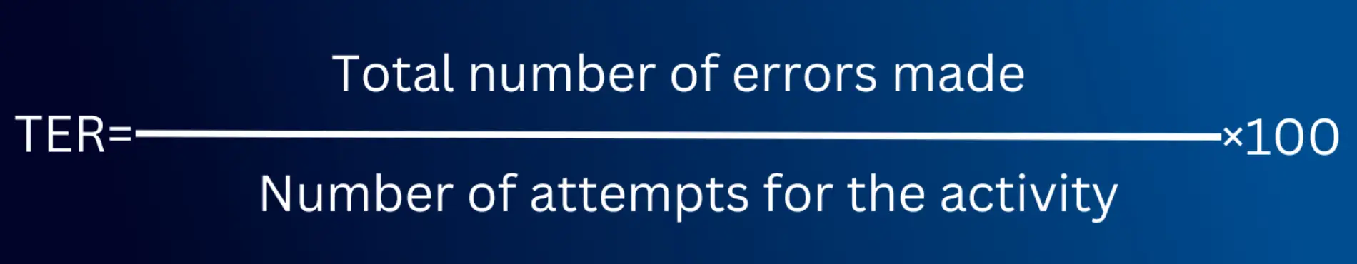
For instance, if a user made 10 errors over 50 attempts at a task, the total error rate would be 10/50 = 0.2 or 20%.
- Error Occurrence Rate, which gives the frequency of a particular error
How to Calculate Error Occurrence Rate
To establish the error occurrence rate, divide the number of occurrences of the particular error by the total number of possible errors for the specific task.
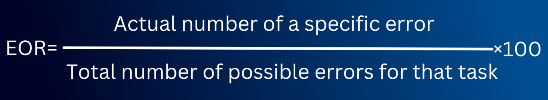
For example, suppose there are 5 potential errors a user could make in a task. If the user committed one specific error 4 times, the error occurrence rate for that particular error would be 4/5 = 0.8, or 80%.
Making errors is natural. However, a high error rate in UX suggests design issues. Recognizing and rectifying these can greatly enhance user experiences and reduce their frustrations.
Navigation Patterns
Navigation patterns examine how consumers navigate through a design, assisting designers in optimizing paths and information flow.
Attitudinal KPIs
Customer Satisfaction Score (CSAT)
CSAT gauges user satisfaction by asking users to rate their experience. It provides valuable insights into how users perceive the design.
How to Calculate CSAT
It’s based on a scale from 1 (very dissatisfied) to 5 (very satisfied) with a question like “How satisfied are you with the service/app?” You can also tailor questions, e.g., “How satisfied are you with finding the desired item?”
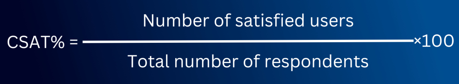
To calculate satisfaction percentage, divide satisfied users (rated 4 or 5) by total respondents and multiply by 100.
Net Promoter Score (NPS)
NPS is a metric that gauges user loyalty and willingness to suggest a design to others. It is an excellent indicator of user advocacy.
How to Calculate Net Promoter Score
To measure it, ask a simple question: “How likely are you to recommend this service/app/website to friends and colleagues?” Scores can range from 1 (not likely) to 10 (very likely).
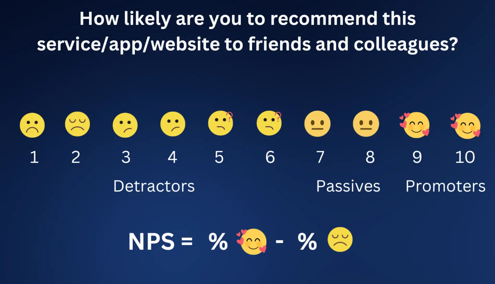
Then, categorize users:
- Detractors (1-6),
- Passives (7-8),
- Promoters (9-10).
Finally, calculate NPS by subtracting the percentage of detractors from promoters.
System Usability Scale (SUS)
SUS, or perceived usability, is a standardized questionnaire that evaluates a design’s overall usability. It offers a numerical score to assess customer happiness. System Usability Scale (SUS)
How to Calculate System Usability
The SUS is a questionnaire designed to measure the usability of tools like websites, products, or software. Users rate the following 10 revised questions on a five-point scale from ‘Strongly Disagree’ (1) to ‘Strongly Agree’ (5):
- I’d want to use this website often.
- This website felt too complex.
- Using this website was straightforward.
- I’d need help to navigate this website.
- The website’s features worked well together.
- This website felt inconsistent in its design.
- Most would grasp how to use this website quickly.
- Navigating this website felt awkward.
- I was confident while using this website.
- I had to learn a lot to start using this website effectively.
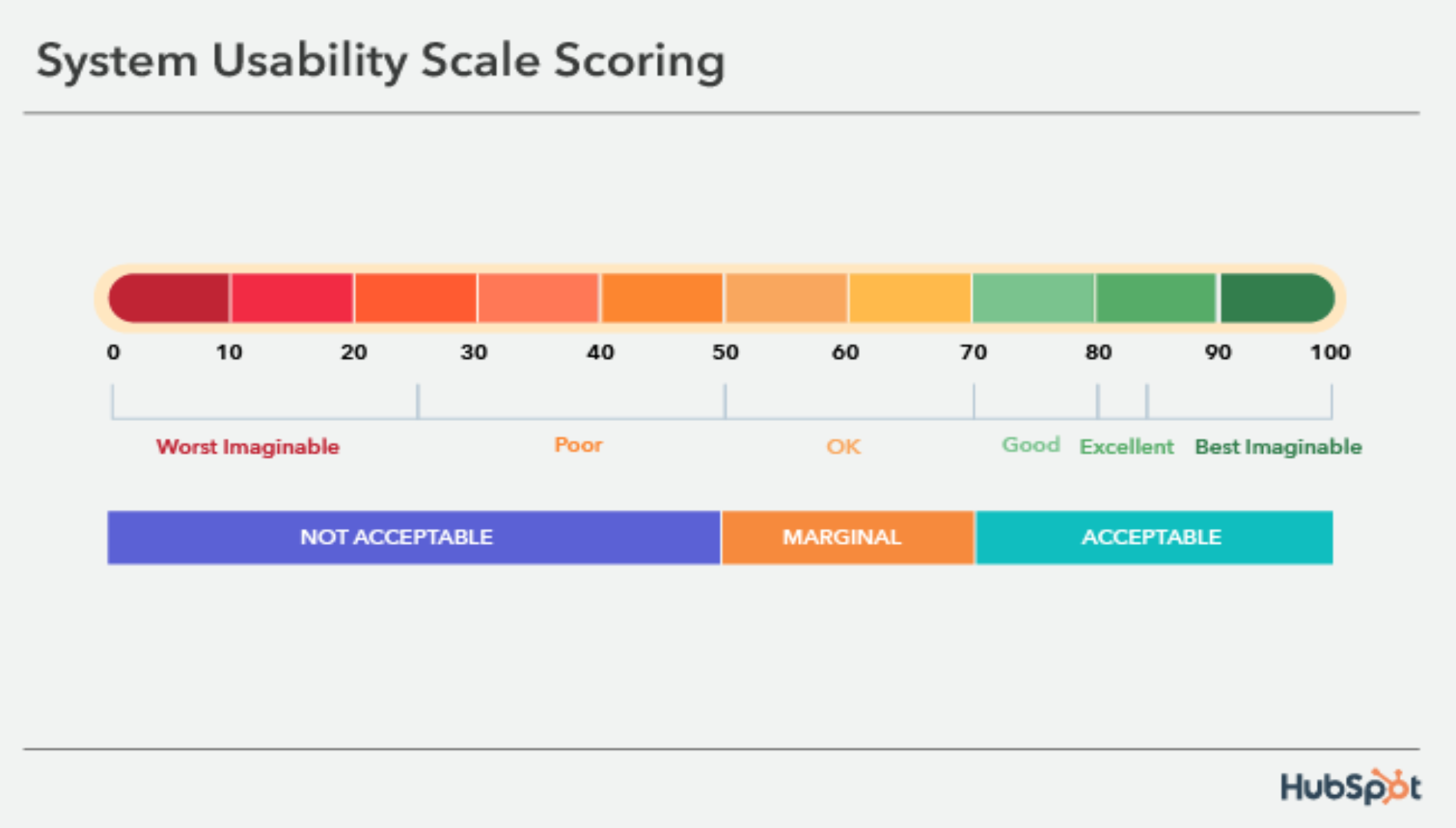
SUS Scoring:
- Odd Score Calculation:
- Sum the scores of the odd-numbered questions.
- Subtract 5 from the result.
- Even Score Calculation:
- Sum the scores of the even-numbered questions.
- Subtract the result from 25.
- Final SUS Score:
- Add the odd and even scores.
- Multiply the sum by 2.5 for a score out of 100.
Score Interpretation:
- Scores below 50: ‘Not Acceptable’
- Scores 51-70: ‘Marginal’
- Scores above 71: ‘Acceptable’
Feature Usage Rate
The feature usage rate tracks the use of specific design features, which helps designers determine which features are most popular with consumers.
How to Improve Your Design Outcomes with Design Metrics and KPIs
Design metrics and KPIs are more than simply measuring tools. They are effective allies in your quest to improve design outcomes. Let’s look at how to use these useful metrics to improve your design game.
Single Out the Most Relevant KPIs for Your Product
Many design KPIs are available for measuring and monitoring UX. However, not all of them are relevant and indicative in your industry scenario. Before selecting UX metrics to track, you must first define what successful user experience means for your specific product. As previously stated, we propose embracing Google’s HEART framework.
For example, if the timely execution of specified activities is critical to the success of your product, investigate the ‘task success’ pillar. Here, you can concentrate on tracking design key performance indicators such as time on task and user mistake rate. Turn your attention to the ‘engagement’ pillar if your product’s primary goal is user engagement. This is the case with an educational app that encourages users to spend at least 15 minutes every day learning within the app. Here, relevant KPIs would include average session time and frequency.
By connecting your chosen UX metrics with your product’s unique aims and objectives, you not only acquire useful insights but also pave the road for a more informed and effective UX strategy.
Match UX Design Metrics and KPIs to Business KPIs
After determining which design key performance indicators should be tracked, the next critical step is to develop a clear link between them and specific business goals. For example, it’s critical to understand how this affects the business when evaluating user engagement through KPIs such as average session time and session frequency. Consider how these engagement metrics can be linked to important metrics such as Customer Lifetime Value (CLV).
However, with KPIs like time-on-task and user mistake rate, the link to revenue growth becomes clear if you focus on task success. Fueled by a frictionless user experience, effective task completion can directly influence income, notably through more successful transactions.
Collaboration with other teams is frequently required in this procedure. You may strengthen the link between UX initiatives and overall organizational success by understanding the business KPIs they track and demonstrating how your UX metrics contribute to these larger objectives. This collaboration ensures that your UX work improves user experiences and contributes to the bottom line.
Always Consider the Wider Context and Remain Human-Centric
As you embrace a data-driven strategy, it’s critical to remember that while KPIs are helpful, they rarely tell the whole story. Contextualizing each KPI and digging deeper is critical for uncovering the entire picture. Consider the key performance indicator ‘task success rate.’ You may see that 84% of users complete a given task successfully. However, this figure does not inherently imply a favorable user experience for all users engaged.
Sometimes, your customer satisfaction rating may be frighteningly low, signaling a problem that the ‘task success rate’ KPI overlooks. This scenario should motivate you to conduct additional research and testing, possibly focusing on user interviews to acquire insights into users’ thoughts and emotions about the task. The idea here is to use data and KPIs as guiding lights while also considering the complexities of human behavior. Take no single KPI at face value, and always be willing to go deeper and probe more to get the complete story behind the figures.
Choose the Right Partner
Working with the right partner can significantly enhance design performance. DEMA Marketing is a viable option for improving your design outputs. Collaborating with design firms like DEMA enables you to benefit from extensive industry expertise, experience, and resources.
Final Takeaway
Including design key performance indicators and metrics into your design processes is about making informed decisions, proving value, and reaching design excellence. You can elevate your design outcomes and create digital experiences that truly resonate with your users and drive success for your organization by identifying relevant UX KPIs, connecting them to business goals, maintaining a human-centric approach, and choosing the right partners.
Frequently Asked Questions
What are KPI for designers?
Design key performance indicators that assess the efficacy of design work. They include user experience measures such as conversion rates, customer happiness scores, and task success rates.
How do you measure design metrics?
Various methods and approaches, including as analytics software, user testing, surveys, and usability testing, are used to measure design metrics. These methods generate quantitative and qualitative data that may be used to evaluate user experience and design effectiveness.
How do you measure effectiveness in design thinking?
Design thinking effectiveness is measured by assessing the influence of design solutions on user happiness, corporate goals, and problem-solving. Metrics such as customer happiness, revenue growth, and user engagement can be used to assess the effectiveness of design thinking.
Why is it important to measure design metrics?
Measuring design metrics is critical because it allows designers to understand how their work affects user experiences and business outcomes. It delivers actionable data that may be used to make educated design decisions, demonstrate value to stakeholders, and continuously improve design methods.


